Duration
8 weeks (2023)
Sector
Real Estate
Platform
Responsive Website
My Role
Solo UI/UX Designer
Competitors Analysis
Wireframes
UI/UX Design
Prototypes
About
SHKP Club
SHKP Club is a Hong Kong first property club, established by Sun Hung Kai Properties (SHKP) in 1996, which now has over 500,000 members. The Club endeavours to provide customer-oriented services, plus to offer members information about and privileges of SHKP developments and shopping incentives. It serves as a bridge for two-way communication between SHKP and the community as well as to build long-term relationships with members.
Project Goal
Since the SHKP Club website was launched a decade ago, it is inevitably that the design style is outdated. Not only that, the website structure was not well planned, the a messy sitemap and clutter in content, therefore result in a poor user experience. As a result, this project aimed to revamp the club website to drive engagement by enhancing functionality and user experience, as well as digitalising data collection in order to extend business potentials and membership competency.
Define
Existing Major Pain Points
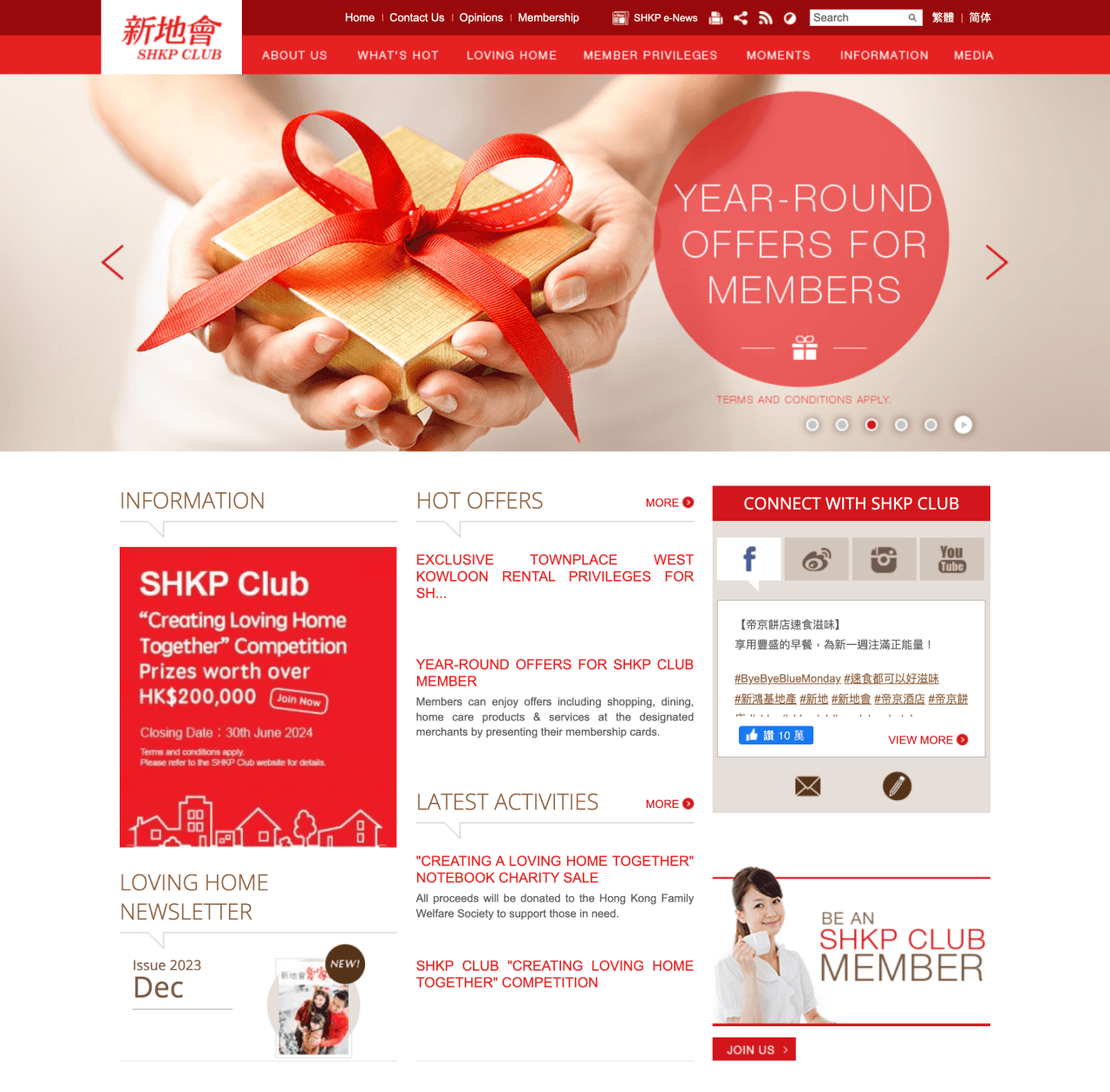
Information Overload
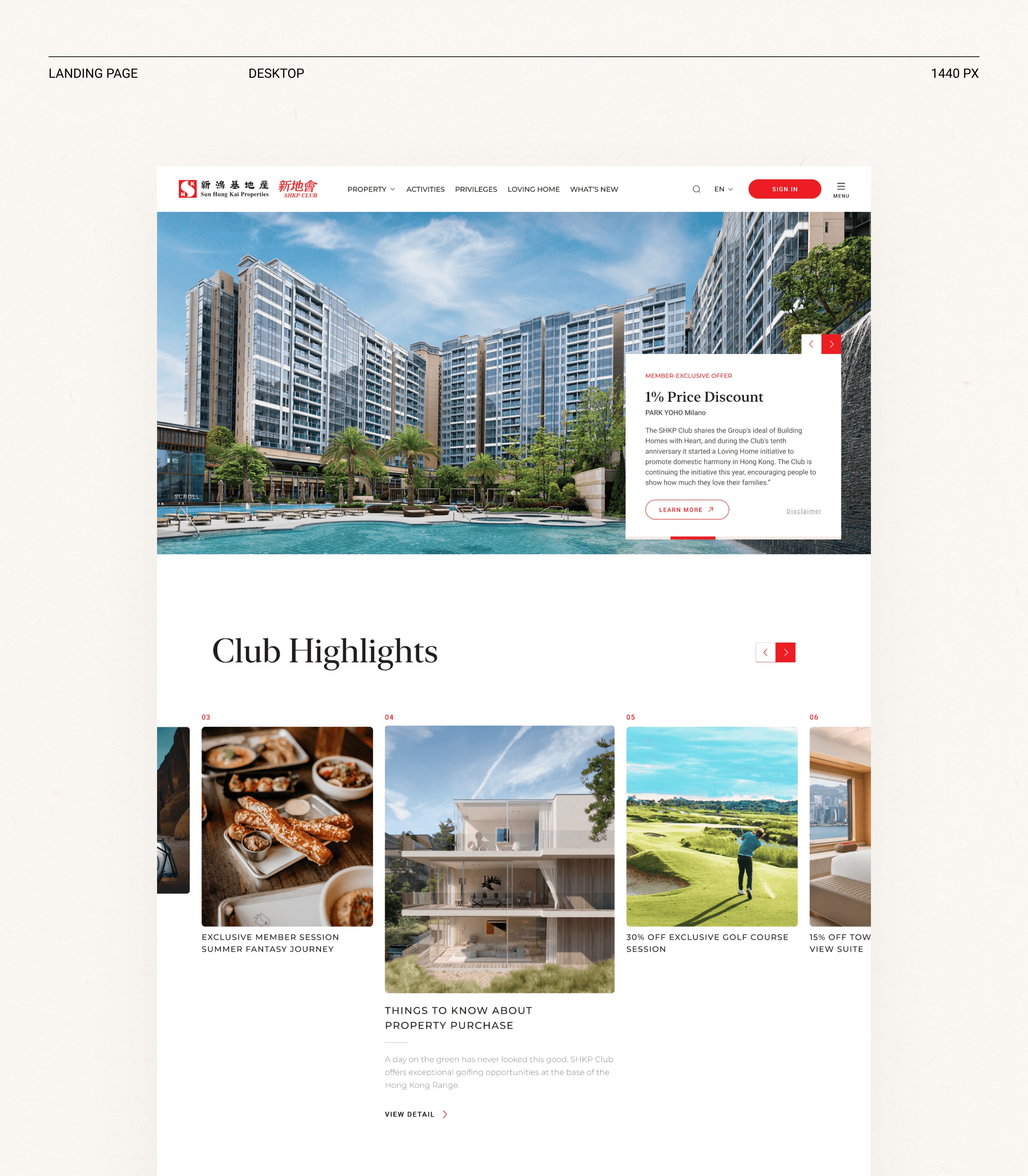
The landing page overwhelms visitors with an abundance of information without clear organization or grid structure. This lack of clarity causes confusion and reduces user willingness to browse further, leading to a high bounce rate.
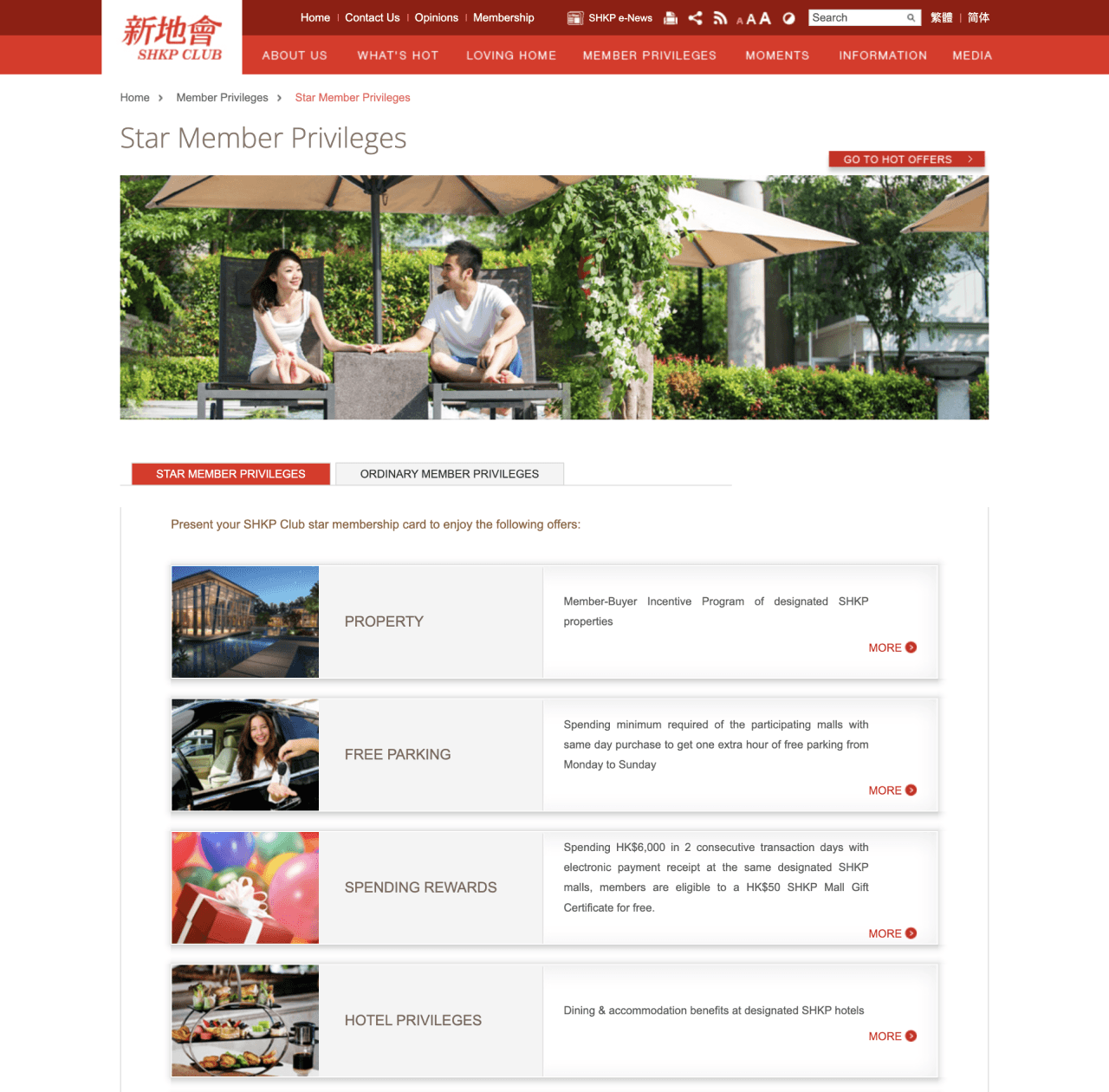
Poor Information Structure
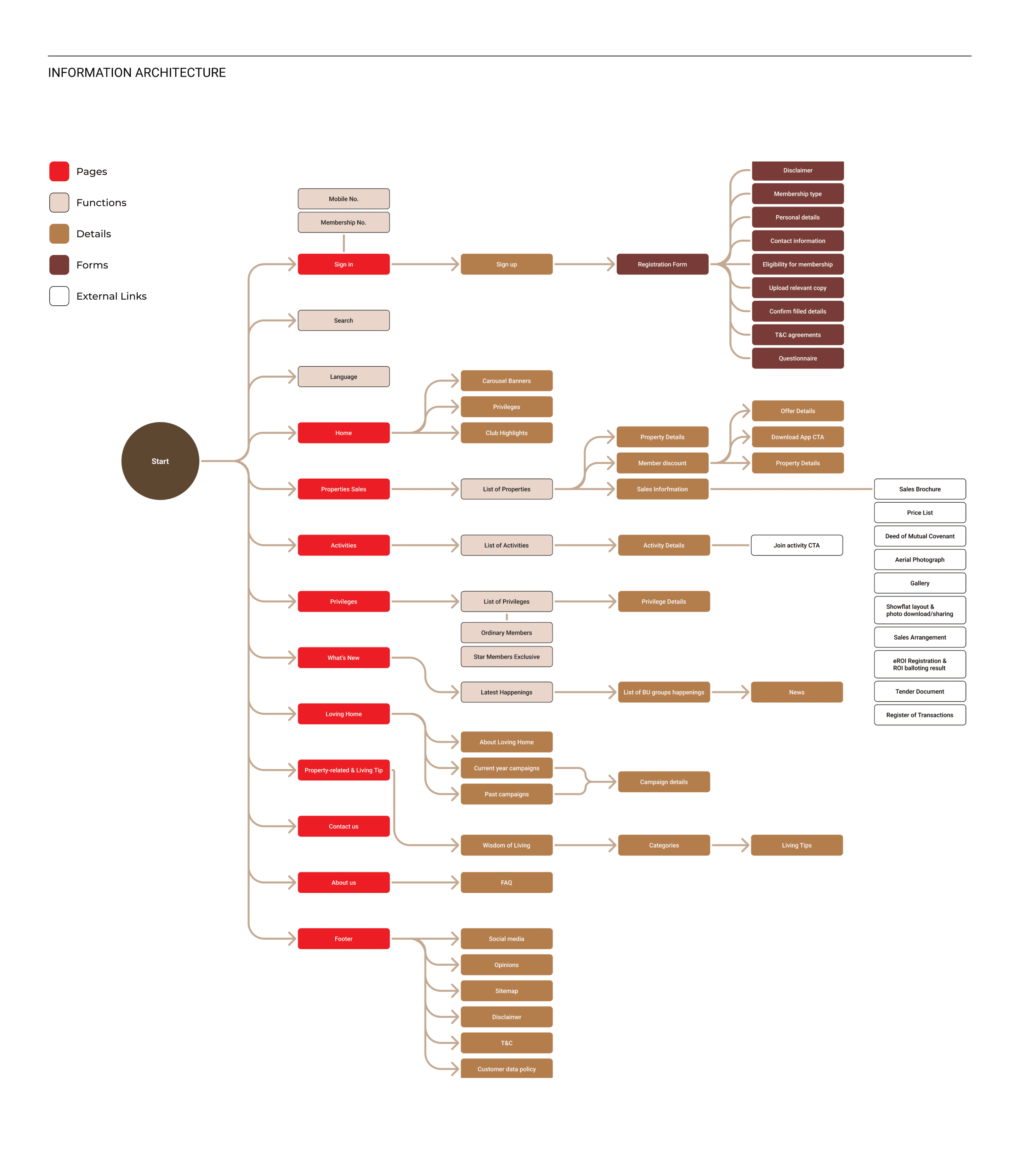
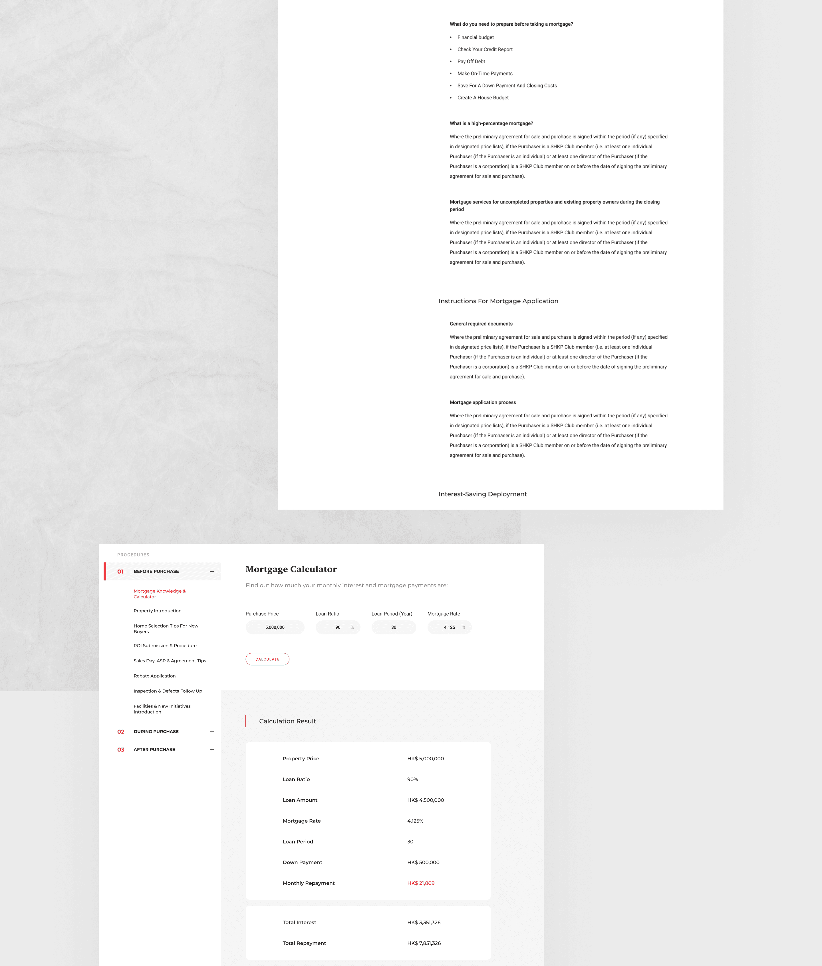
The website lacks a clear information hierarchy and categorization, making navigation difficult. Content is also unnecessarily divided into separate categories, cluttering the site.
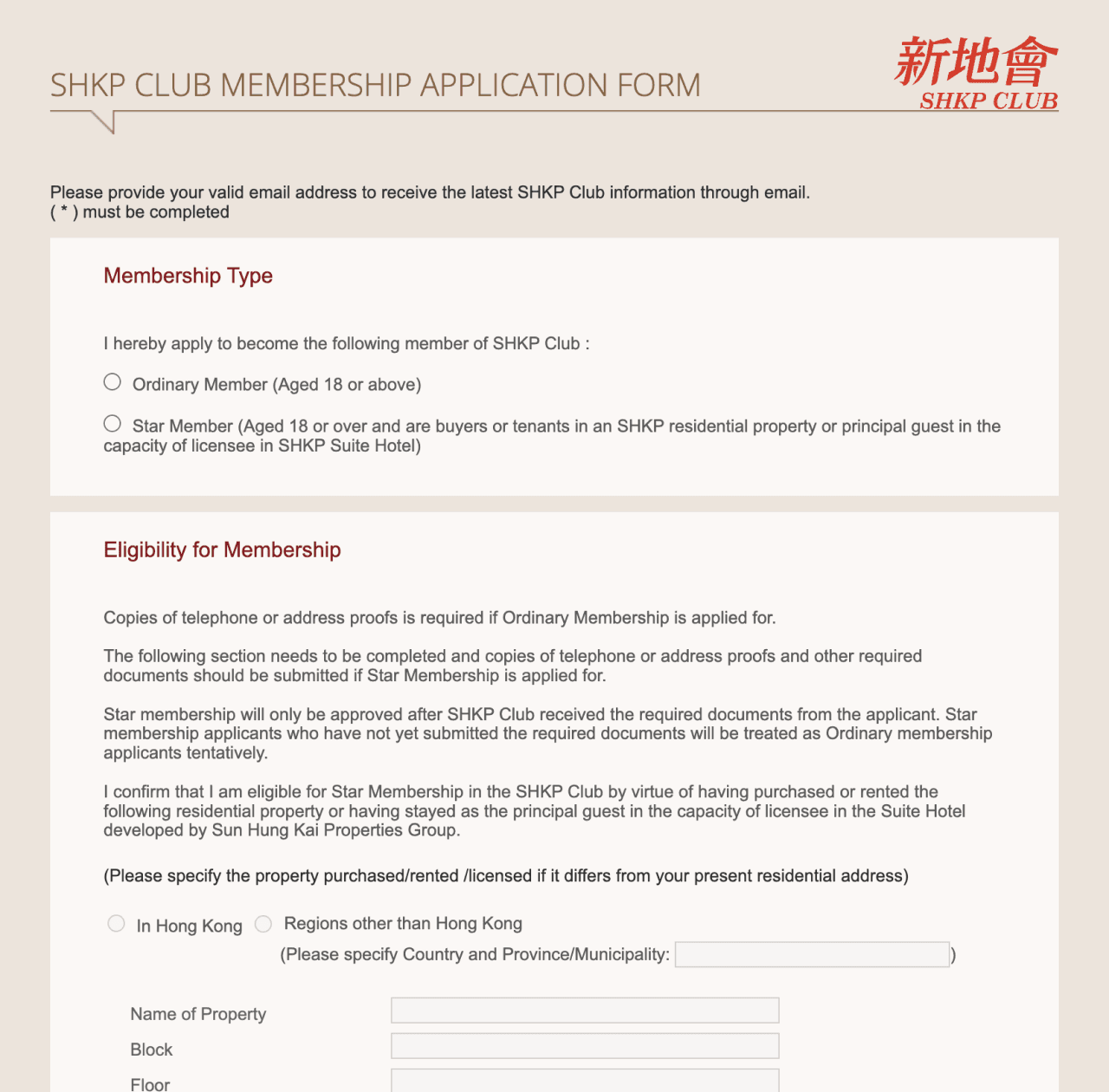
Tedious Application Form
The registration process consists of one long form, which is a dated practice and discourages membership sign-ups.
ideation
How Might We
To frame the design process, I identified a few "How Might We" questions, which I constantly asked myself throughout the design process.
Design Principles
To ensure consistency and alignment with both user expectations and business goals, I defined the following design principles as the foundation of my process:
Design for accessibility
Considering all user groups when handling the navigation flows. The target users’ age range was set to be 30-50, which is fairly broad.
Keep it as simple as possible
Ensure that users are not bombarded with more information than they can handle. Optimize with design patterns that users are already familiar with.
Design for familiarity
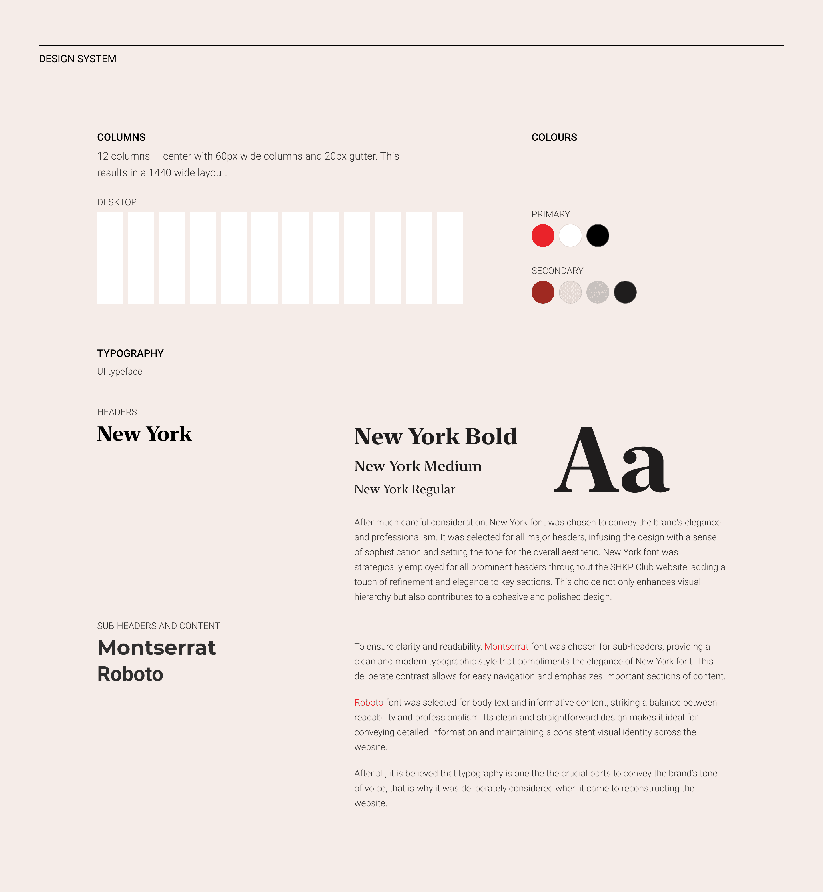
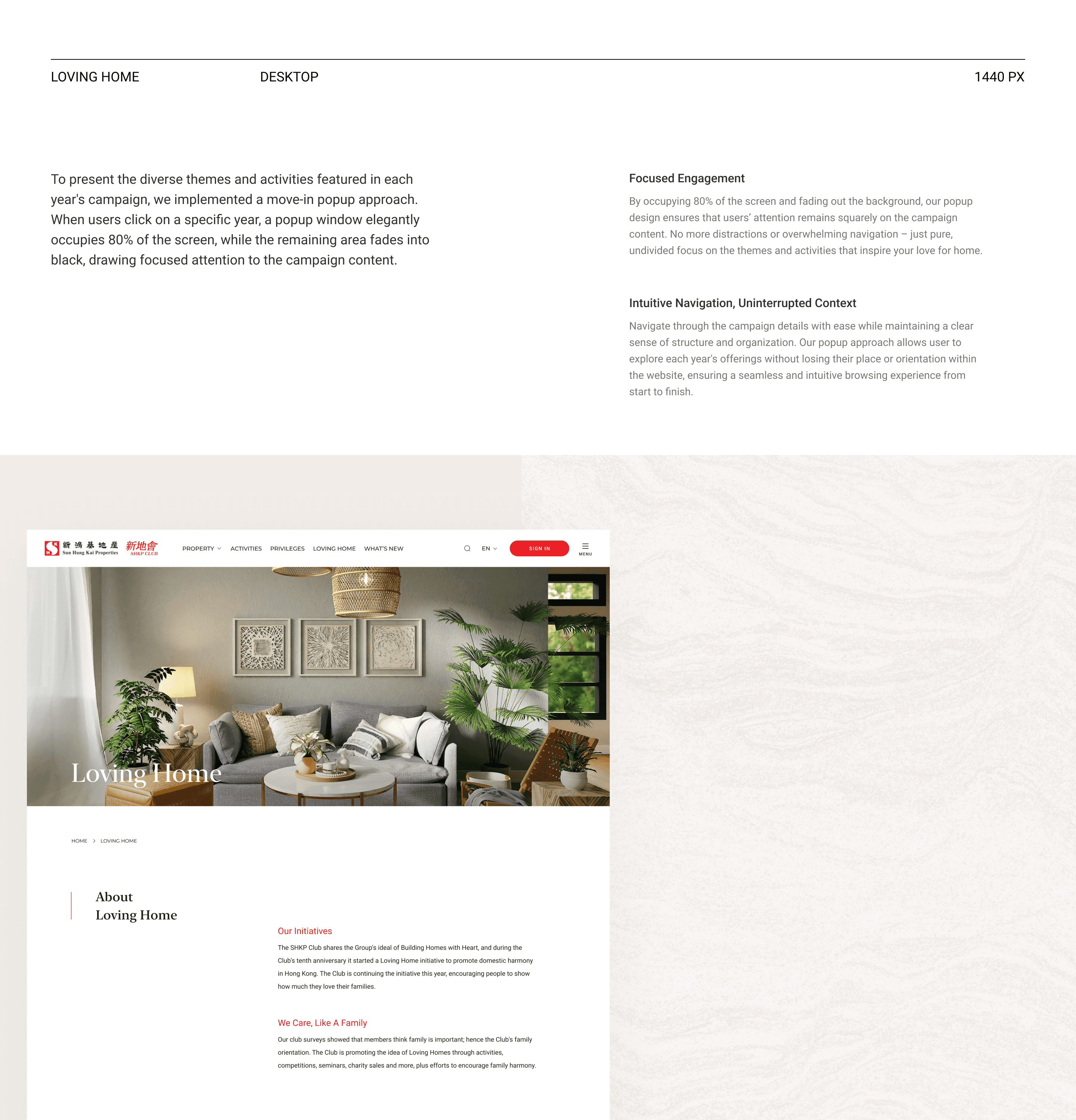
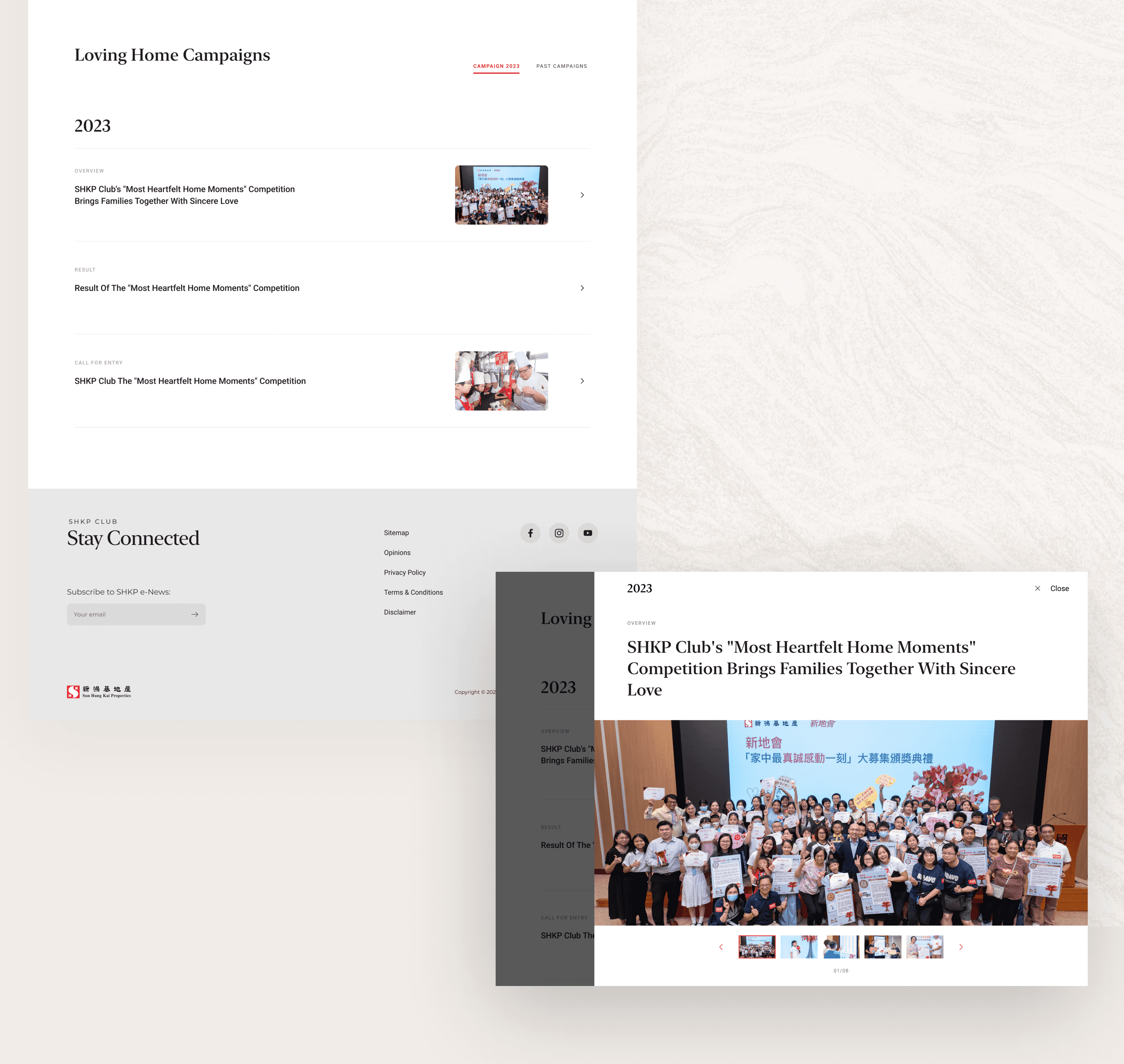
Remaining the established SHKP brand identity, while introducing the brand new modern design style. Approaching with accent typeface, new layout structures, and a new grid system.
Design Solutions
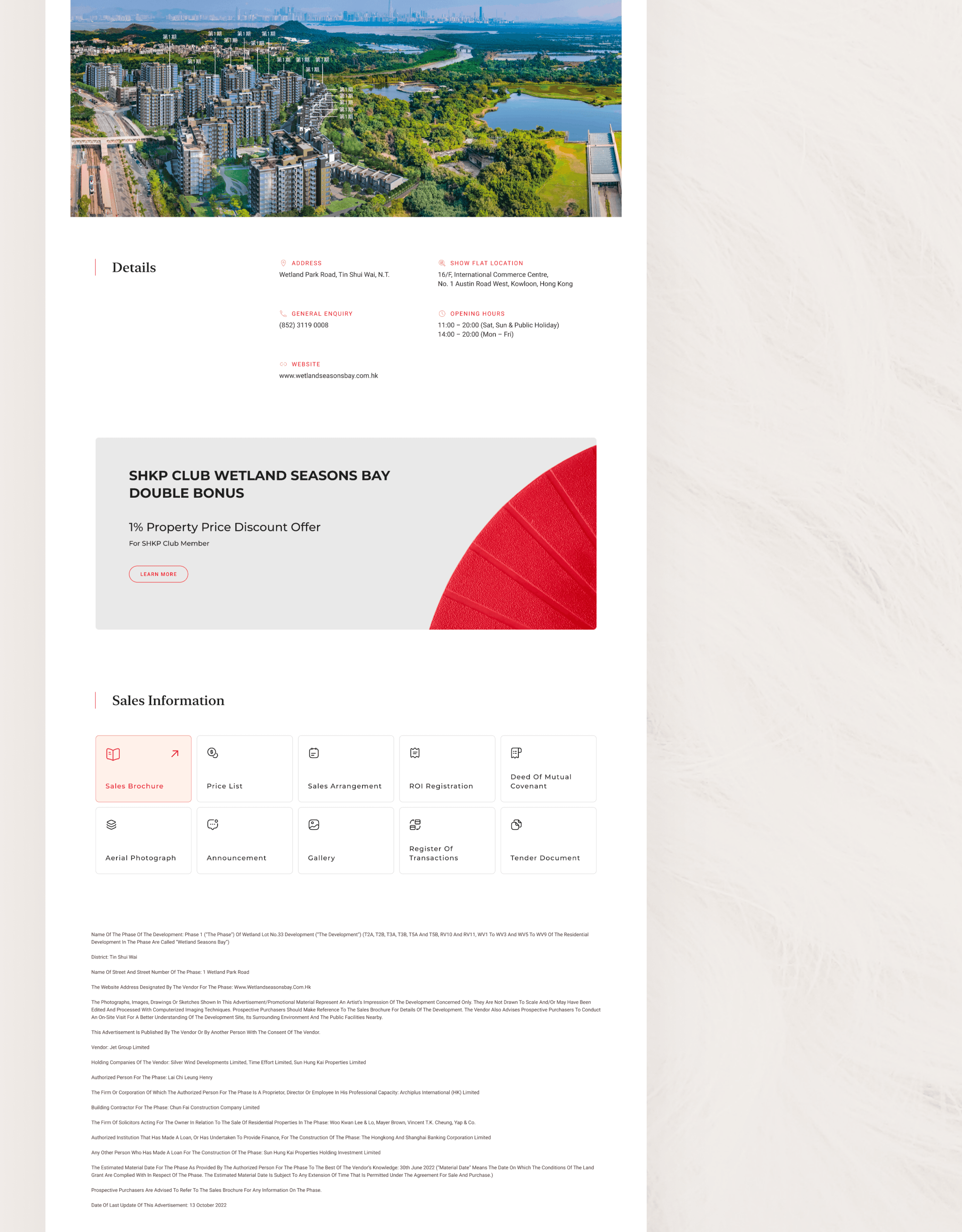
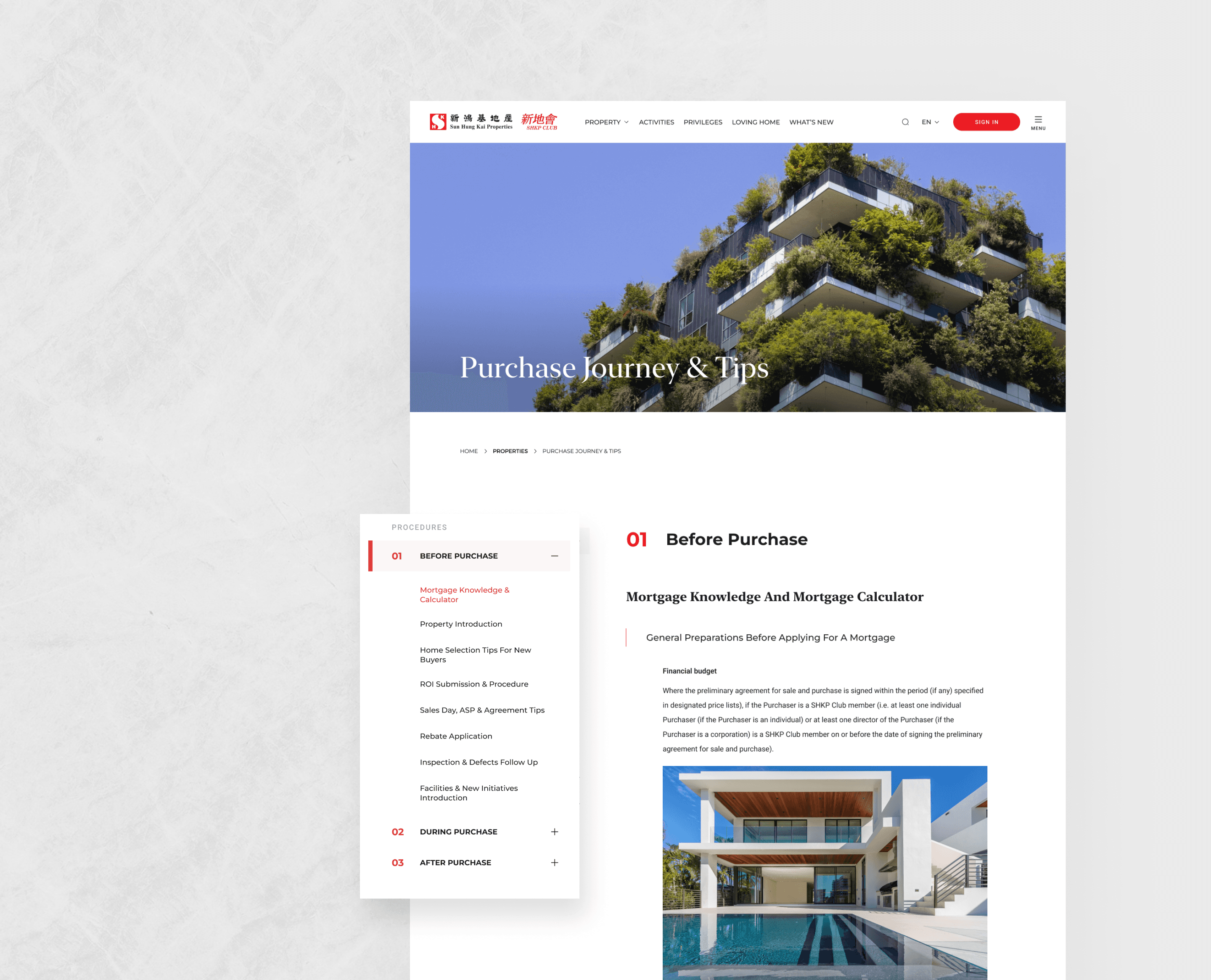
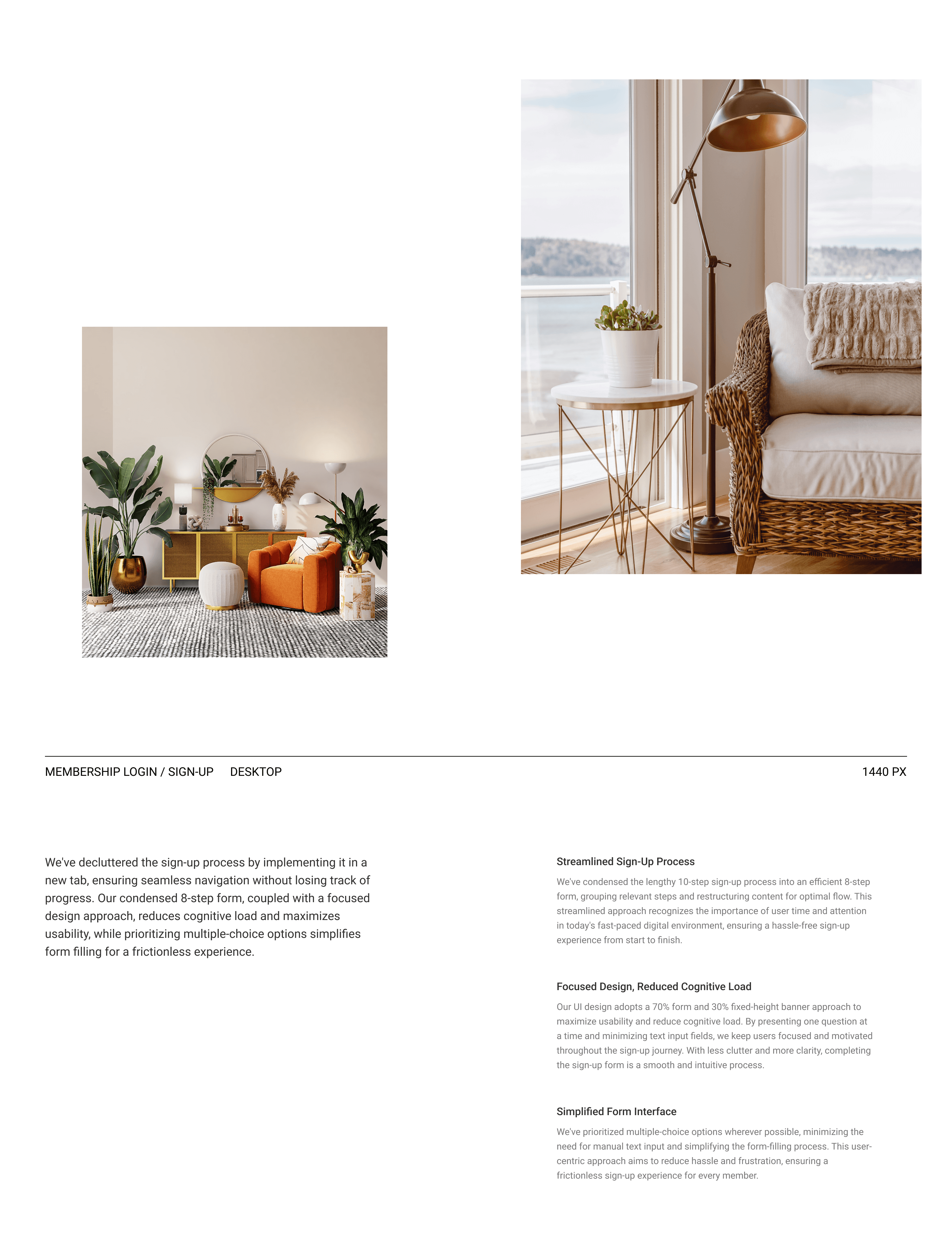
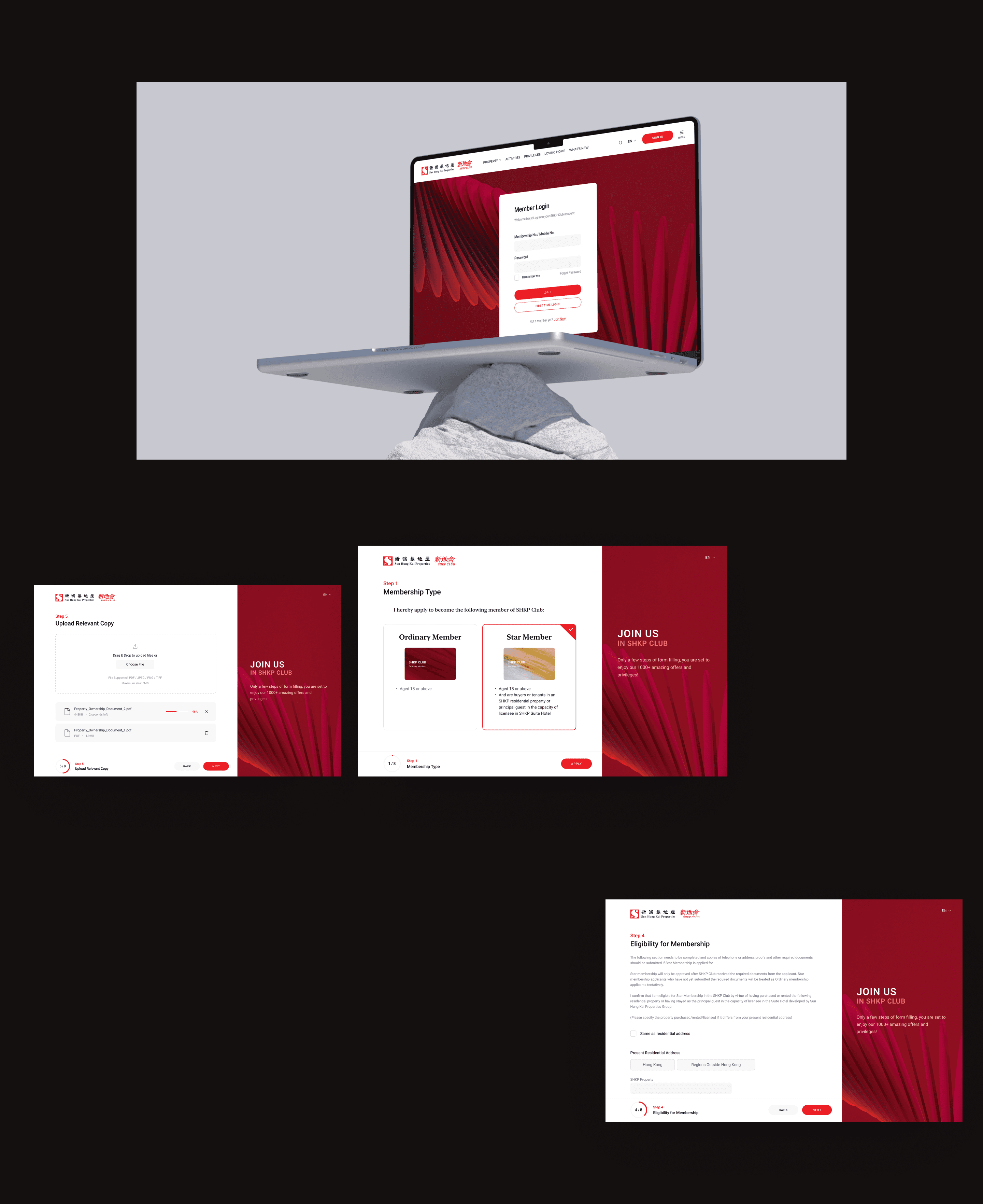
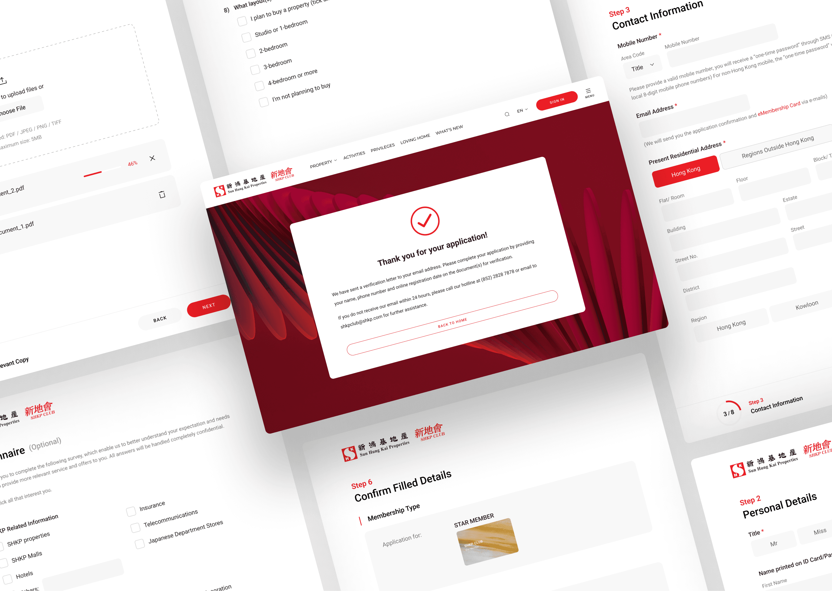

Takeaways from the Project
There are a few things I have learned in this projects, which I believe have a great impact on my later work style as a UI/UX designer.
Propose and Communicate
I've come to understand the importance of proactively proposing optimal design solutions, even when clients have strong preconceived ideas about how the design should be executed. While clients may have specific preferences, it's essential to remember that their expertise may not lie in UI/UX design. Therefore, effective communication and negotiation are key. Scheduling dedicated time for discussions with project managers and clients allows for productive exchanges, ensuring that design decisions align with both client expectations and user-centric principles.
Expectation Management
Recognizing that clients may struggle to visualize designs based solely on verbal descriptions, I've adopted a practice of providing references or simple design demos upfront. This preemptive measure significantly reduces the need for extensive back-and-forth iterations, enhancing project efficiency and fostering clearer alignment between client expectations and design outcomes.
Options with Contrast
I have found that offering design options with distinct contrasts early in the project lifecycle proves beneficial. By presenting variations in color themes, typefaces, navigation styles, or layout structures, it not only helps narrow down client preferences but also aids clients in identifying their preferred design direction more easily. This approach not only streamlines decision-making processes but also facilitates collaborative exploration of design possibilities.


